It’s Resume Month! Check back every week to see how you can increase your chances of landing a job by improving your resume and cover letter—it’s resumes, and resumes only, for this month!
Noticed a job posting that you’re thinking of applying to? Chances are that the job posting has been noticed by hundreds of other curious candidates too, and the process for each candidate is the same: apply through email, or apply through a website. Unless you know the hiring manager personally, the only way to stand out from the crowd is through a well-designed resume.
If you’re a graphic designer, chances are you already have a resume that’s well designed, but for all other professions, a traditional resume (designed in Word or InDesign) is what you’re working with. And while resumes for other professions can have elements of graphic design associated with them (e.g. a resume geared for the advertising industry might lean towards the creative side), normally the customization is limited to bolding, underling, and italicizing.
Your resume serves a specific purpose, and that’s to get noticed by the hiring manager. As a result, you need to strategically customize your resume with the limited number of tools you have available in order grab the hiring manager’s attention—too much customization and your key points will all blend into one another, too little customization and your resume will be flat and boring.
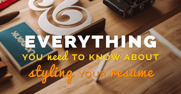
Here’s everything you need to know about styling your resume:
Use the right fonts—and don’t be afraid to use more than one.
Choosing the right fonts services two purposes. First, the right fonts ensure that your resume is legible—no matter how much experience you have, it will be all for naught if the hiring manager can’t read anything you’ve outlined Second, the right fonts add stylistic elements to your resume, which helps break up sections into chunks, while simultaneously showcasing your personality. Who knew that a simple font choice could do so much?
Throughout everything you do on your resume, make sure you’re always consistent
If you’re applying at a company that’s a bit more conservative in nature (e.g. a bank or accounting firm), you might want to stick with a classic font. Times New Roman is a classic, but at this point it might be a bit outdated—try Cambria, Tahoma, or Verdana, instead. If you’re applying to a company that’s a bit more loose and relaxed, use a sans-serif font—something that feels younger and freer than its serif counterparts.
“No matter which font family you choose, your résumé typeface should be easy on the eyes and show up well both in print and on a screen, regardless of size or formatting,” says Nicole Fallon, author of The Best Fonts to Use on Your Resume.
“It’s also a good idea to choose a standard, universal font that works on any computer’s operating system, as your résumé will also likely be scanned by automated applicant tracking software.”
The follow up to using the right fonts is to use the right size. If your font is too small your resume will appear overcrowded; too big and your resume will appear empty. And always remember that your resume needs to be legible for both desktop and print.
Depending on what font(s) you’re using, stick between size 10-12 for body text, no bigger than 14-16 for sub headers, and 22-24 for your header (your name). Be sure to view your resume (and cover letter) as a Word document, PDF, and print out to ensure the size of your font is legible across all formats.
Use (Appropriate) Visual Elements
Don’t be afraid to incorporate line breaks, bullet points, tabs, and more into your resume layout. All these visual aids help guide the eyes of the hiring manager to read through the resume in the way you intend it to be read—otherwise the resume will just look like a wall of words.
Line breaks help separate your resume into digestible pieces, bullet points direct the hiring manger to key career related achievements, and colours (never more than one, outside of the traditional black) are used to highlight school names and company names. And then… there’s bold.
Be Bold
Going bold is the most common stylistic element when it comes to design. Bolding is an easy way to highlight everything from school names to job titles to section headings and more. But bold should never be overused—it’s most effective when used sparingly to highlight a few key pieces of information. For example, if you bold a company name, you don’t need to bold your job title at that company—the contrast between bold and normal helps with legibility, whereas using bold for both would just blend the two together.
Keep in mind that a hiring manager’s eyes will jump to what sticks out to him or her first, which will usually be the bolded elements (even if you have other stylistic elements on your resume). As a result, you shouldn’t bold elements that aren’t understood without content, or that aren’t even important to begin with.
Under no circumstances should you bold any of the descriptions of your job(s) or accomplishments. This makes it seem like only the bolded portions of your job descriptions and accomplishments are important, whereas the non-bolded portions are “empty” achievements.
Be Consistent
Throughout everything you do on your resume, make sure you’re always consistent. Don’t use size 12 font when outlining your education history, but size 11 font when outlining your job history. If you bold the names of the companies you’ve worked for, you should also bold the names of the universities you attended. Make sure that your em dashes, en dashes, and hyphens are all consistent (and more importantly, that you’re using all three correctly).